013
Typographic Posters: Expanding Space in 7 Ways.
Returning to the basics of formal development through space, texture, light, and meaning. This exercise expanded on a methodology that takes simple grid-based structures and magnifies it through the lense of a word using artificial effects in a digital world.
Returning to the basics of formal development through space, texture, light, and meaning. This exercise expanded on a methodology that takes simple grid-based structures and magnifies it through the lense of a word using artificial effects in a digital world.
Specs: Digital (20×28")
Proposed offset printing with fluorescent and metallic spot colors instead of CMYK. Two blacks and 6 spot colors were used to create unity in the set.
Proposed offset printing with fluorescent and metallic spot colors instead of CMYK. Two blacks and 6 spot colors were used to create unity in the set.
—
Credits: (Art Director & Designer) Scott Massey; (Printer) Unknown RGB, 2020.
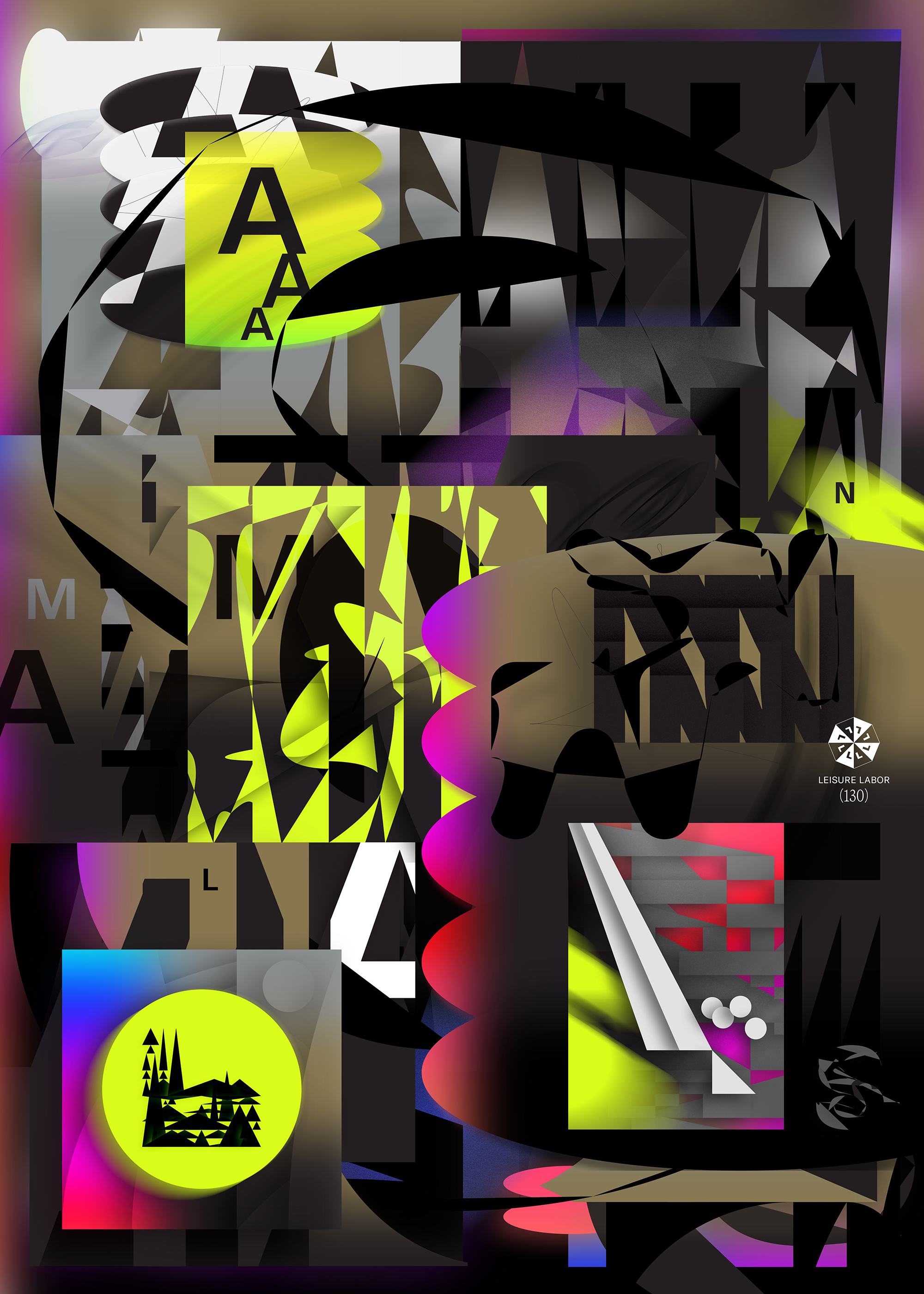

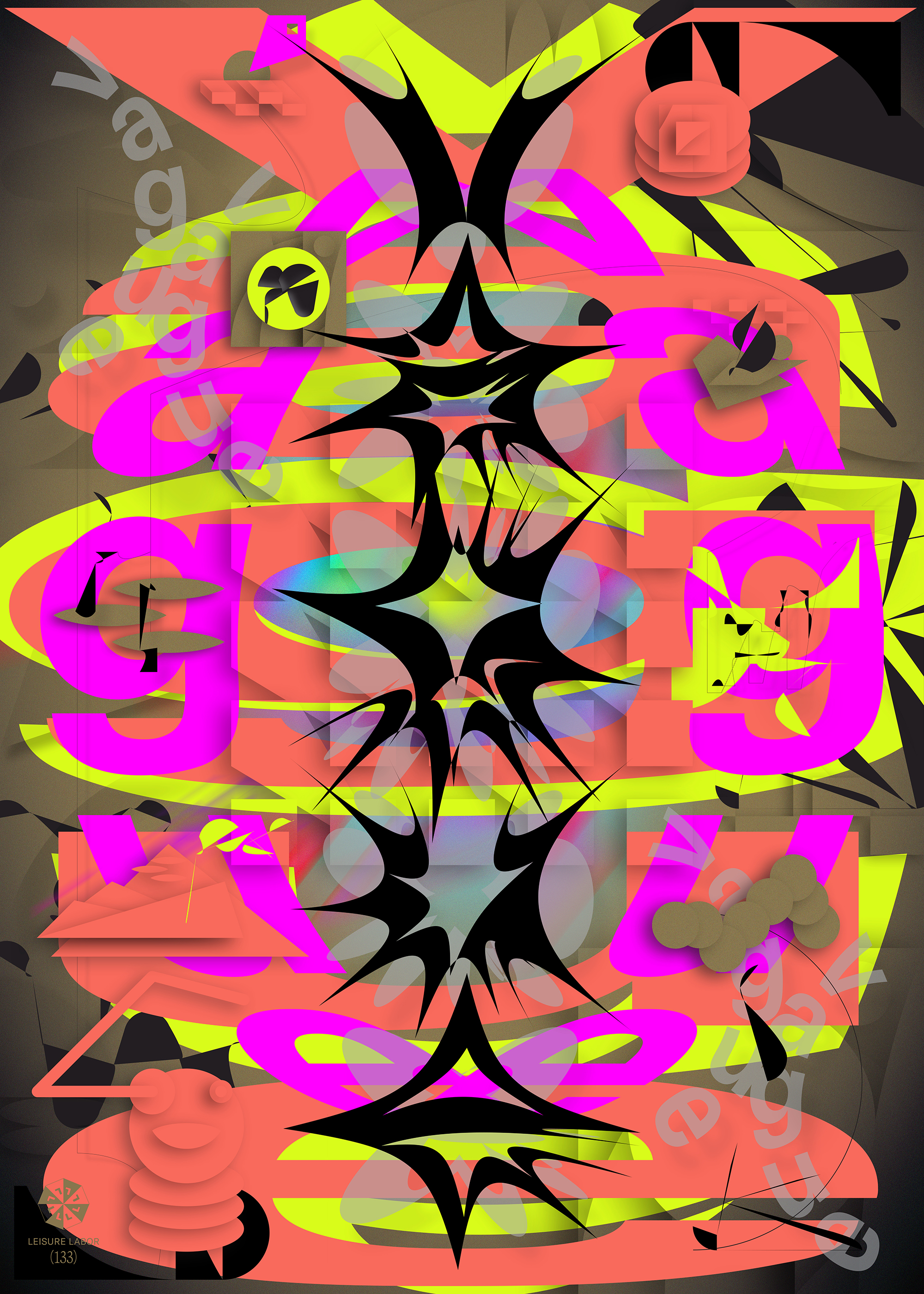

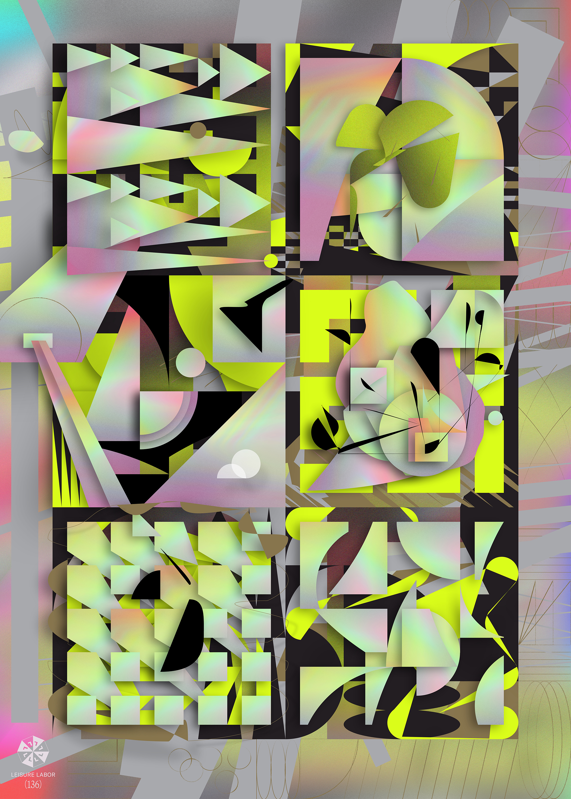
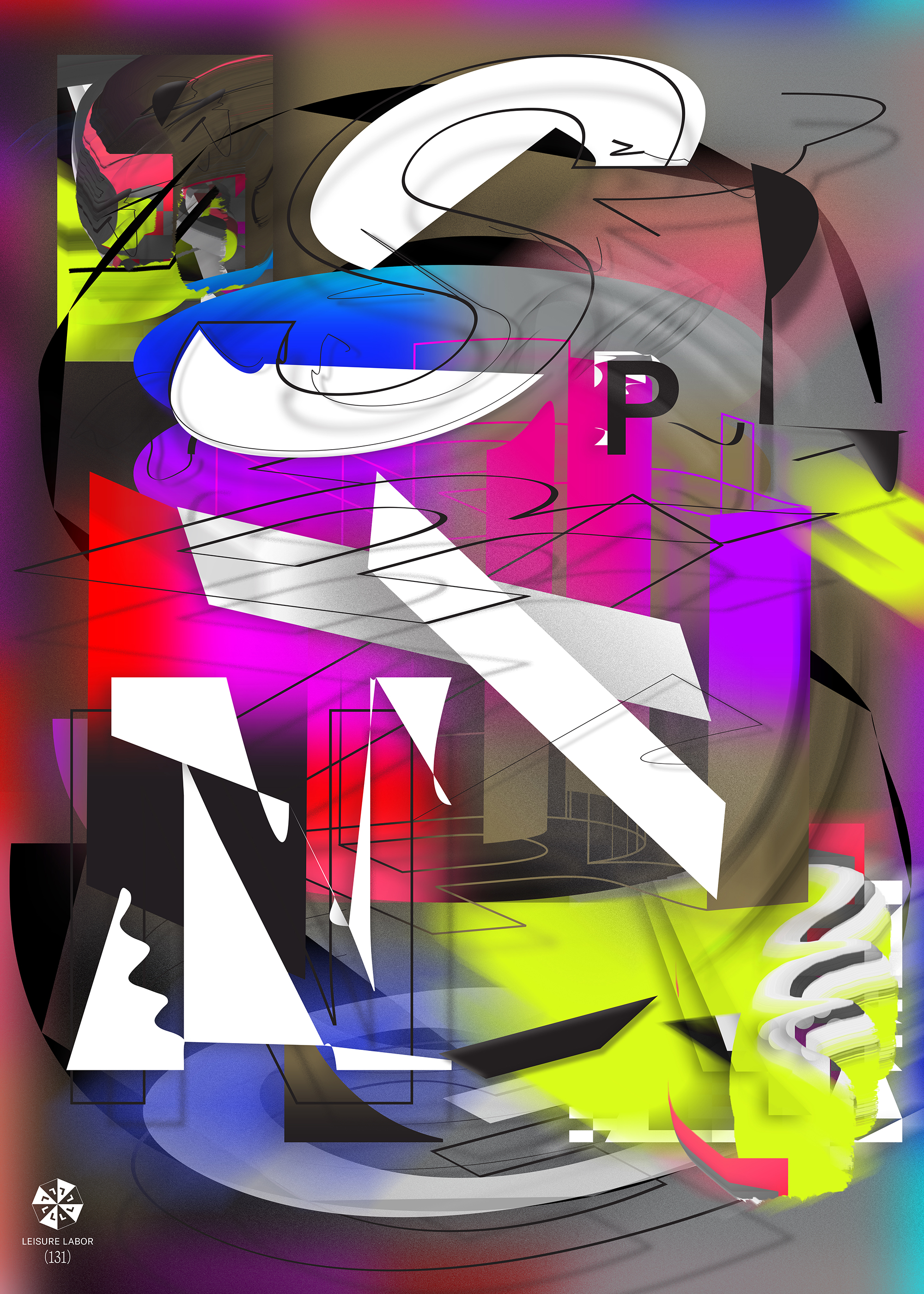
Captions: (1) Each word created a new strategy to explore, keeping the color palette and forms consistent allow for more emphasis to come from the manipulation of type; (2) Each poster has conceptual references that come from Pop culture, science, and politics. An example: Vague was created with a Tim Barber photo in mind where the subject holds up a flower to the camera, concealing his face.
︎︎︎ All work ©Nohawk, LLC 2026.